How to Choose an Effective Color Palette for Branding Projects Easily
March 6, 2026

Choosing an effective color palette is one of the most important decisions you’ll make in any branding project. This rebrand illustrates how choosing an effective color palette and cohesive visual identity can strengthen brand recognition and connect meaningfully with your audience, which are key goals for any branding project. A brand color palette is the set of colors you choose to represent your business. The way these colors are combined into a color scheme creates a cohesive look and helps evoke specific brand emotions, ensuring visual consistency across all marketing materials. This guide is designed for B2B companies, nonprofits, and branding professionals who want to create a memorable, trustworthy, and actionable brand presence. You’ll learn why color matters, how to select the right palette, and how to apply it consistently across all your brand touchpoints, from logos and websites to videos and print materials.
We’ll briefly cover the process of choosing brand colors and the vital role color plays in branding, design, and communication.
Why Color Palette Matters in Branding
Color is more than just decoration. It’s a strategic tool that shapes how audiences perceive your brand. A well-defined color palette differentiates a brand from its competitors. The right palette can boost recognition, build trust, and drive engagement. Research shows that consistent use of brand colors increases recognition, which correlates with higher purchasing intent and donor confidence. Understanding how to choose and apply a color palette is essential for any organization looking to stand out and connect with its audience. Being aware of current color trends is also important when building a brand identity, as these trends can influence perception, mood, and visual appeal.
Northlife Church: A Real-World Example
In 2023, Northlife Church in St. Germain seized the opportunity to refresh their brand as they expanded to a second campus. Their goal was to create a unifying identity that reflected their broader regional presence and mission. Through an immersive branding workshop, we developed the name Northlife Church, symbolizing both their northern roots and spiritual growth.
The new logo features a compass pointing north around a rustic cross, with colors inspired by the local lakes and community warmth, paired with clean typography to convey a welcoming, timeless brand. Their updated website highlights key information like service times and sermons with an engaging, user-friendly design. Check out our Northlife Church case study to learn more.

This guide walks you through a practical, step-by-step framework for choosing a color palette that works across logos, websites, videos, and campaigns. At Backflip, we obsess over color decisions before we ever roll a camera because we’ve seen firsthand how the right colors transform a brand from forgettable to unforgettable.
What you’ll learn:
- How to ground color decisions in brand strategy, not personal preference
- The color theory basics every marketing team needs to know
- A practical system for building and testing your palette
- How to document colors so your entire team stays consistent
Step 1: Clarify Brand Strategy Before You Pick a Single Color
Define Brand Personality
Jumping straight to color selection is one of the most common mistakes we see in branding projects. Different demographics respond to different hues, so choosing different colors can help ensure your palette resonates with your target audience’s psychological profile. Before you explore a single hue, you need clarity on your brand’s mission, values, audience, and positioning. Otherwise, you’re making arbitrary choices that dilute your identity instead of strengthening it.
Identify Key Emotions
Think about how different the palette needs to be for a Wisconsin healthcare system versus a Madison craft brewery versus a Catholic diocese. The healthcare system might require calming, desaturated blues that signal stability to anxious patients. Blue and green are often chosen in this context because they can have a calming effect, helping to create a welcoming and trustworthy brand image for patients and visitors. The craft brewery could thrive with vibrant oranges and ambers that stimulate energy and appetite. The diocese often leans into deep purples and golds rooted in centuries of liturgical tradition. Same state, vastly different color requirements.
Determine Target Audience
Before your team debates whether blue or green “feels right,” document the strategic foundation first:
- Brand personality: Is your brand bold or understated? Premium or accessible? Playful or serious? Select main colors that reflect this personality and resonate with your target audience.
- Key emotions to evoke: Trust, energy, contemplation, warmth, authority, creativity?
- Target audience: Who are you speaking to, and what do they need to feel?
- Primary business goals: Are you driving donations, app signups, in-person visits, or sales?
- Brand values: What principles guide your organization and should reflect in your visual identity?
Capture this in a simple one-page brand brief that becomes your north star. Every color decision must answer to this document. In our experience, having this foundation in place reduces revision cycles by roughly 50% because stakeholders evaluate palettes against strategy rather than personal taste.
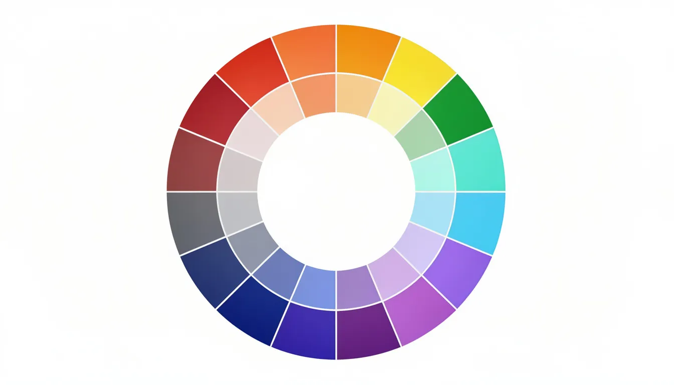
Step 2: Understand the Basics of Color Theory & Terminology
Color Theory Essentials
You don’t need a design degree to choose colors strategically. But you do need to understand how colors relate to each other and why some combinations work while others fall flat. Consider this section your quick-reference primer.
- Hue: Refers to the pure color position on the color wheel—red, blue, yellow, and everything in between. When people say “blue” or “green,” they’re typically talking about hue.
- Saturation: Describes a color’s intensity or vividness. High saturation creates bold, eye-catching colors like the fiery reds sports brands use to grab attention. Low or desaturated colors feel more subdued and professional—think of the muted blues financial services companies favor to project reliability.
- Brightness (or value): Measures how light or dark a color appears. High-value pastels feel approachable and friendly, while low-value, deeper tones convey premium sophistication. IBM’s deep navy communicates something very different than a nonprofit’s cheerful sky blue.
Warm vs. Cool Colors
- When creating a brand color palette, it’s important to consider whether you want to use warm or cool colors as these categories influence the mood and perception of your brand.
- Warm colors like red, orange, and yellow feel energetic, urgent, and action-oriented. Target’s red bullseye creates a sense of excitement that drives impulse purchases.
- Cool colors like blue, green, and purple feel calm, stable, and trustworthy. LinkedIn’s blue fosters professional trust—and 92% of Fortune 500 logos feature blue for good reason.
Basic Harmony Types to Know
-
Complementary – Colors on the opposite side of the color wheel
-
Example: FedEx’s purple and orange create high contrast and memorability.
-
-
Analogous – Colors sitting next to each other on the color wheel
-
Example: Spotify’s range of greens creates organic, flowing visual harmony.
-
-
Triadic – Three colors evenly spaced around the color wheel
-
Example: UPS’s brown, orange, and yellow provide balanced energy.
-
-
Monochromatic – Different shades and tones of a single hue
-
Example: Tiffany’s blue variations create luxurious cohesion.
-
Understanding Color Codes
Understanding color codes such as RGB, HEX, CMYK, and PMS is vital for creating consistent designs across digital and print media. RGB works for digital screens, HEX is the shorthand for web (#RRGGBB), CMYK handles print, and Pantone provides exact spot color matching. At Backflip, we lock these codes in early to prevent the 15-20% color discrepancies that pop up when video, web, and print assets aren’t aligned from the start.
Step 3: Use Color Psychology Intentionally (Without Falling for Myths)
Color psychology is critical in branding to evoke specific emotions, build recognition, and influence consumer behavior, as color can increase brand recognition. Color psychology is a useful tool, but context changes everything. The same color can communicate trust in one industry, danger in another, and celebration in a different culture entirely. Use these associations as starting points, not universal rules.
Core Color Associations for B2B and Nonprofit Brands
Brands That Prove Long-Term Consistency Works
Netflix has owned its red since the mid-2000s DVD envelope era, and that colour still signals entertainment excitement today. John Deere’s green has represented agricultural reliability for over a century. United Way’s blue has communicated dependability since 1887. Using the same colors across all branding elements ensures consistency, visual harmony, and helps build trust with your audience.
A well-defined, consistent color palette not only differentiates your brand from competitors but also builds trust and recognition with your audience.
Color Psychology in Motion
When we produce video at Backflip, we think about color psychology in motion. For a multi-year, large-scale awareness campaign in 2022 for Your Call MN (Human Trafficking Prevention), we strategically selected a palette of red, yellow, tan, and blue shades. This thoughtful palette and our partnership with Turn It Up Media helped the campaign achieve over 240,000 organic and boosted impressions, more than 4.1 million paid ad impressions, 60,000+ video views from 15,000+ unique viewers, and 44,000+ page views, demonstrating how effective color choices can drive engagement and awareness.
Watch the 20-minute short film we produced for the campaign:
Practical Guidance
- If your primary goal is trust and clarity, start your exploration with blues and balanced neutrals, then test warmer accent colors for calls-to-action. Use contrasting colors for CTAs to ensure clarity and usability, making them stand out for users.
- Ensure accessibility: Make sure there is sufficient contrast—at least 4.5:1—between text and background colors to meet Web Content Accessibility Guidelines (WCAG) for readability.
- Establish consistency: There are various ways to establish and implement brand color guidelines, such as creating a brand style guide, using digital asset management tools, or providing color swatches and codes for different media. This helps maintain consistency across all brand elements and platforms.
- Remember cultural context: If your brand operates internationally, research how colors translate. Red symbolizes luck and prosperity in many Asian markets, which is why Coca-Cola’s red plays especially well there—but it can signal danger or warning in Western contexts.
Step 4: Audit Competitors and Your Category’s “Color Norms”
How to Conduct a Competitive Color Audit
A visual competitive audit reveals the “color sea” of your industry and exposes opportunities for differentiation that pure creativity might miss.
Steps:
- List your top 10 competitors plus 5-10 adjacent brands in related categories.
- Screenshot homepages and logos for each—grab their primary marketing materials too.
- Arrange everything on a single board using Figma, Miro, or even printed pages on a conference table.
- Step back and observe the dominant patterns.

What to Look For
- Dominant hues repeated across your category
- Patterns by sub-segment (tech companies versus traditional manufacturers)
- Gaps where no competitors occupy certain color territory
- Opportunities for modern palettes—like teal and charcoal combinations—that stand out
Document 2-3 Strategic Directions
-
Blend with a twist – Use category-appropriate hues with unique saturation or brightness.
-
When to use: When trust matters more than disruption.
-
-
Deliberately contrast – Choose the opposite of category norms.
-
When to use: When differentiation drives competitive advantage.
-
-
Category-adjacent inspiration – Pull palettes from parallel industries.
-
When to use: When you want to feel modern without alienating traditionalists.
-
This audit typically cuts design time by 30% because it grounds creative exploration in competitive reality rather than starting from scratch.
Step 5: Build a Working Palette Structure (Core, Neutrals, Accents)
Palette Roles Explained
Most brands need fewer colors than they think. An effective brand color palette typically includes:
- 1-2 primary colors
- 2-3 neutrals
- 1-2 accents
This structure provides flexibility without chaos.
- Primary color(s): Drives your logo, key headlines, and major brand surfaces. This is what people remember.
- Neutral colors: Handle backgrounds, typography, and layouts. Think off-white (#F5F5F5), charcoal (#333333), and soft grays. These workhorses make your primary colors shine.
- Accent colors: Draw attention to CTAs, badges, notifications, and important UI elements. These create action.
The 60-30-10 Rule
The 60-30-10 Rule dictates that a color palette should consist of 60% primary color, 30% secondary color, and 10% accent color for balance. On a homepage or fundraising landing page, this means your background and body text live in neutrals, major sections and navigation use your primary, and buttons or key actions pop in your accent.
Real-World Example
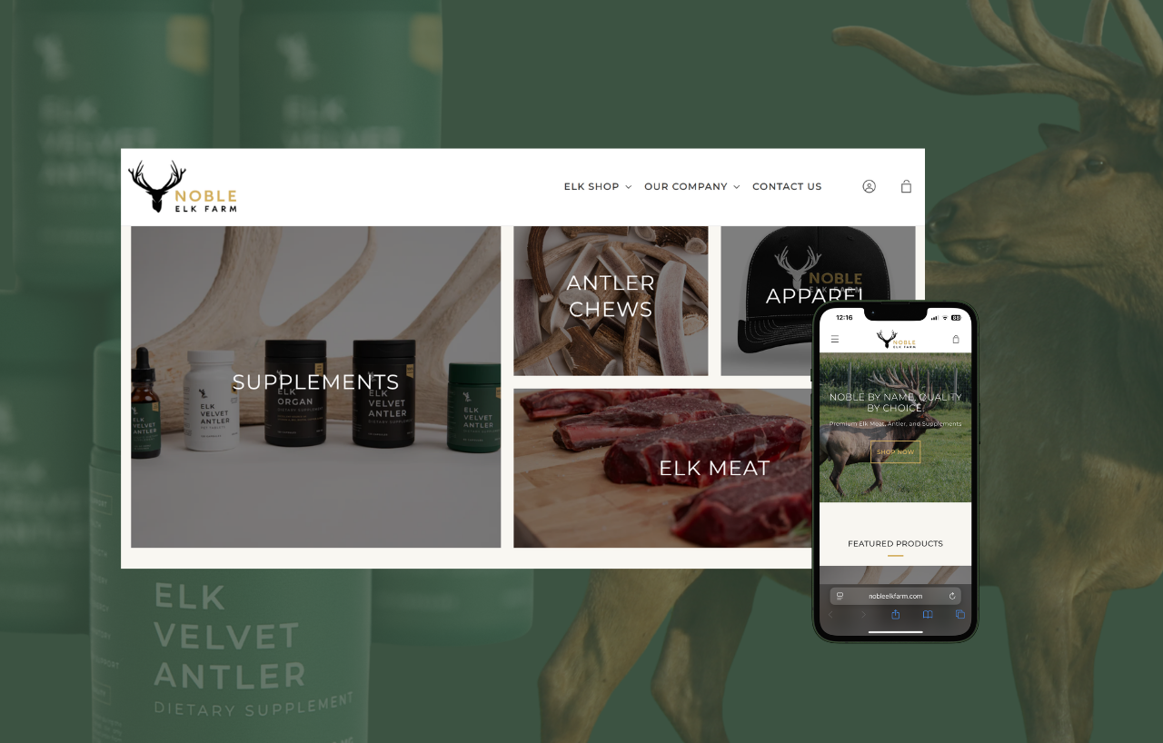
We developed Noble Elk Farm’s palette using gold (#d3b16a) as the primary color, complemented by black, white, and beige neutrals, with a dark green (#296141) accent. The gold buttons on their website have been shown to increase click-through rates compared to neutral colors.
When we prototype palettes for projects at Backflip, we drop the colors directly into frame mockups to see if they hold in motion. This stage is about drafts, not decisions. You need to test these colors against actual brand applications before committing.
Step 6: Test Your Colors in Real Brand Contexts (Especially Video and Web)
Why Testing Matters
Screens, paper, signage, and motion all render colors differently. OLED displays shift hues 15-25% compared to standard LCDs. Print dulls saturation by 10-20%. A palette that looks perfect in Figma might fail in your actual marketing contexts.
Color Testing Checklist
-
Logo on light backgrounds – Check whether contrast meets WCAG AA accessibility standards (4.5:1 ratio).
-
Logo on dark backgrounds – Check whether the color holds its visibility or requires a light variant.
-
Website hero section – Evaluate whether the colors convey the intended mood at full scale.
-
Mobile UI – Ensure buttons and text remain legible on small screens.
-
Video lower-thirds – Confirm graphics remain clear in motion and under varying lighting conditions.
-
YouTube thumbnails – Determine whether the palette creates a strong “thumb-stop” effect in a crowded feed.
-
Social media templates – Check that accent colors stand out against platform interface colors.
-
Print collateral – Verify that CMYK conversion preserves the intended colors.
-
Projector presentations – Test whether the palette remains visible in dim conference room lighting.
At Backflip, we prototype palettes directly inside video frames and website mockups before any final decisions. This reveals issues that static swatches hide, like gradients washing out or accent colors losing punch in motion. Roughly 40% of untested palettes fail when they hit real production.
Accessibility Matters
Use tools like WebAIM’s contrast checker to verify your combinations meet accessibility standards. Approximately 70% of websites fail basic color accessibility tests, which excludes audiences and creates legal exposure.
Test with Real People
Run simple A/B tests on landing pages or social thumbnails over a 2-3 week period. HubSpot data shows CTA color variations can produce 15-50% differences in performance. Let data guide your final choices.
Step 7: Document a Clear Color System & Usage Rules
What Your Color Guidelines Should Include
A brand color palette only works if it’s documented clearly enough that any team member or vendor can follow it consistently. Without documentation, colors drift, and your brand loses recognition.
- Color swatches showing each color in the system
- Color codes for every context: HEX for web, RGB for digital, CMYK for print, Pantone for exact matching
- Primary/secondary/accent distinctions with clear role definitions
- Do/don’t examples showing correct and incorrect usage
Practical Usage Rules to Document
-
Tint ranges – Primary colors may be used at 80%, 60%, 40%, and 20% tints.
-
CTA reservation – The lime accent color is reserved exclusively for buttons and key calls-to-action.
-
Color count limits – Use a maximum of 4–5 colors per layout.
-
Forbidden combinations – Avoid yellow text on white backgrounds because it fails contrast accessibility standards.
-
Background rules – Avoid pure black (#000000) for digital backgrounds; use rich black or dark gray instead.
Deliverables We Typically Hand Off at Backflip
- PDF brand guide with visual examples
- Editable design library with color styles
- Figma or Adobe color style definitions
- Google Slides and PowerPoint theme templates with locked colors
- Canva brand kit setup for clients who use that platform
Setting up brand libraries inside the tools your team actually uses—like a Canva brand kit or PowerPoint theme—enforces 95% compliance day-to-day. This prevents the vendor errors and internal drift that erode brand consistency over time.
Step 8: Evolve Your Palette Over Time Without Losing Recognition
Examples of Gentle Evolution
Great brands evolve their palettes, but they rarely reinvent completely. Strategic evolution means adjusting saturation, expanding neutrals, or adding new accent colors while preserving the core identity that audiences recognize.
Google refined its logo colors throughout the 2010s, lightening saturation by approximately 10% to optimize for digital screens, but the four-color foundation remained instantly recognizable. NFL teams like the Green Bay Packers have modernized their greens for contemporary applications without abandoning the heritage colors fans identify with.
When to Consider Palette Evolution
- Major positioning shift: A local nonprofit expanding nationally in 2025 may need colors that work beyond regional associations
- Merger or acquisition: Combining brands requires thoughtful color integration
- Digital experience overhaul: Legacy colors that fail accessibility tests need updating
- Audience evolution: Your customers’ expectations shift over time
At Backflip, we often treat early campaigns or pilot videos as live tests for palette refinements. This generates real-world performance data before committing to a full guidelines update. It’s cheaper to adjust colors during a campaign than to overhaul an entire brand system.
Keep a visual record of past palettes and iterations so internal teams understand what changed and why. This historical context eases adoption when updates happen and prevents circular debates about “why we changed that blue.”
Practical Tools and Workflow Tips for Brand Color Selection
Recommended Tools
You don’t need expensive software to choose colors strategically. Here’s a curated toolkit and workflow that works for most branding projects:
- Adobe Color: Create harmonies using the color wheel and extract palettes from images
- Coolors: Generate palettes quickly and use the eyedropper tool to pull from inspiration images
- Figma: Define color styles that sync across your entire design system
- WebAIM Contrast Checker: Verify accessibility compliance for any color combination
A Repeatable Workflow
- Gather inspiration (Week 1): Create a mood board with imagery, competitor screenshots, and color inspiration from adjacent industries.
- Extract and explore (Week 2): Use Adobe Color or Coolors to pull palettes from your mood board and explore different color combinations.
- Apply to mockups (Week 3): Drop your top 2-3 palette directions into quick website and video mockups.
- Narrow and refine (Week 4): Gather stakeholder feedback and narrow to a single direction.
- Test in production (Weeks 5-6): Apply the palette to real assets and run A/B tests where possible.
Collaborative Best Practice
Create one shared “color exploration” board per project where stakeholders can see the evolution and rationale. This prevents the frustration of teams reacting to a single final option without understanding how you got there.
At Backflip, we bake this workflow into our discovery and design phases, making color selection collaborative but strategically grounded. The fun part is exploring possibilities, but the real value comes from testing those possibilities against business goals.
Conclusion: Build a Palette That Tells Your Story Everywhere
Choosing an effective color palette isn’t about picking colors you personally like. It’s a strategic process that starts with brand clarity, moves through color theory and competitive analysis, and ends with tested, documented systems that work across every medium.
The right color palette supports your business goals everywhere your brand shows up: on websites, in videos, across print materials, and throughout social feeds. When colors are chosen strategically and applied consistently, audiences feel what your brand stands for before they read a single word. Studies show that strategic palettes boost marketing ROI by 20-30% compared to arbitrary color choices.
We recommend revisiting your palette every 3-5 years to ensure it still reflects who you are and how you show up in the market. Brands evolve, audiences change, and design styles shift. Your colors should grow with you.
If you’re ready to build or refine a color system that works across video, web, and every touchpoint that matters, let’s talk brand. At Backflip, we help Madison and Wisconsin organizations create visual identities that don’t just look good, but actually drive real results.
