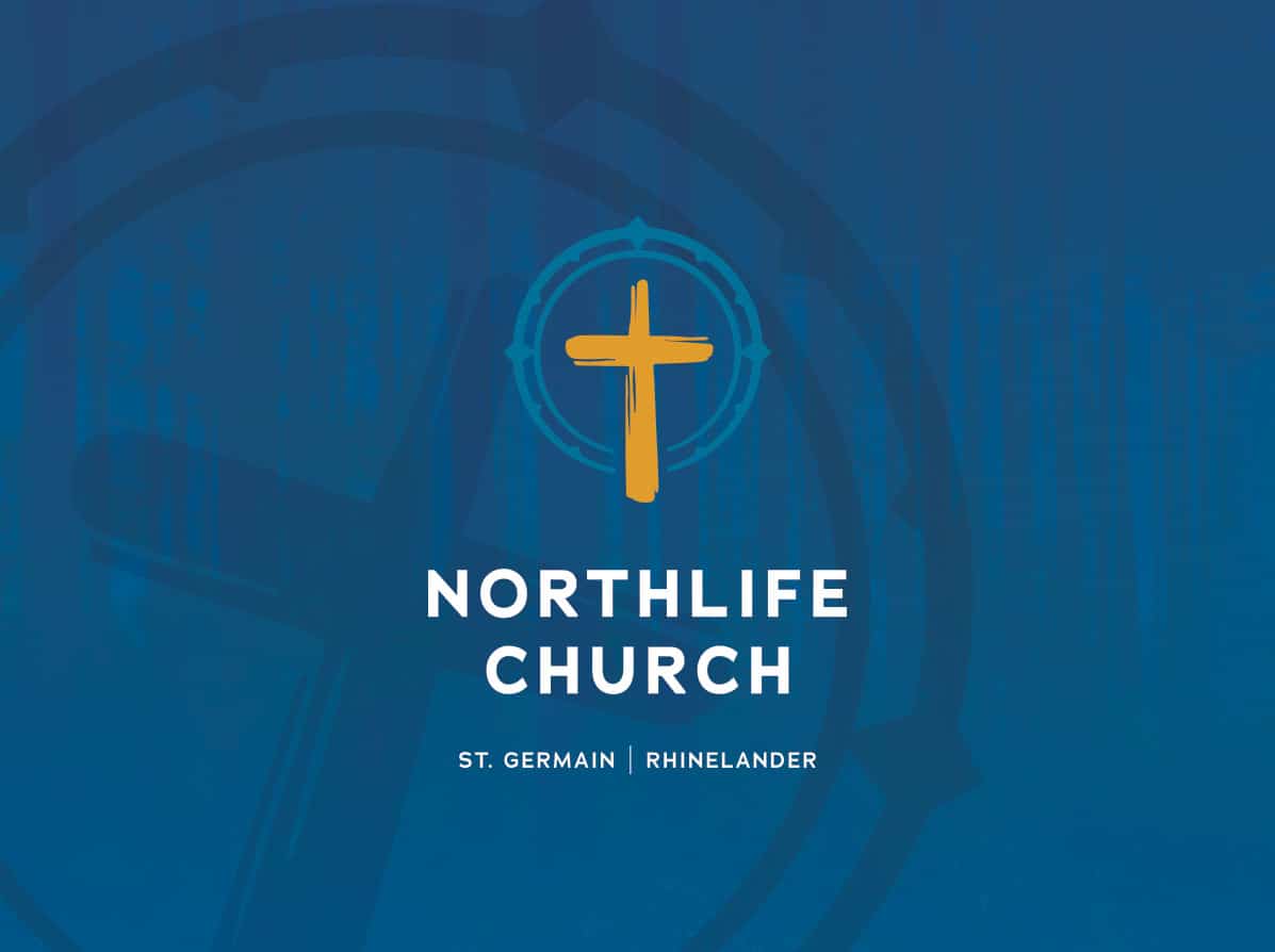
As the Evangelical Free Church in St. Germain embarked on expanding their presence with the launch of a second campus in a nearby community, they recognized the perfect opportunity to rejuvenate their brand. Their objectives were clear: to refine their identity, reflect their broader regional influence, and foster unity within their community. The pursuit of a unifying name that embodies "one church—two locations," along with their values required a comprehensive rebranding effort, encompassing a fresh name, a new logo, and an updated website.
A New Name
To gain deeper insights into this church and its community, our initial step in the rebranding process involved an intensive one-day branding workshop.
John and Hannah ventured into the north woods, immersing themselves in the church’s environment, and collaborating closely with the staff and church elders. This experience was filled with brainstorming sessions, uncovering the authentic purpose of the their community, and delineating their distinct attributes then molding this into a new yet familiar and welcoming identity.
Together we decided the new name would be Northlife Church. Two words with so much meaning hidden in them, reinforcing the church’s connection to its location and its mission to inspire spiritual growth. It’s a way of life and also speaks to their belief that “Jesus is the way, the truth, and the life—He is our True North.”
A New Look
Once the new name was established and approved by the congregation we began to conceptualize the new look. Hannah worked to create three concepts that brought to life this new vision for the church. Each one highlighted the deeper meaning of the name in a special way. We were aiming for something that looked and felt welcoming, was fresh and timeless, and would be undeniably Northlife Church as soon as you saw it.

From there, Hannah played with the various typefaces, colors, positions of the compass, adding more definition and texture, and even updated the cross to better resemble a massive handmade cross that sits in their worship space (seen in the second concept above).
After a few rounds of revision to polish things up the client landed on the final logo – a compass pointing due north surrounding their recognizable rustic cross, using colors that referenced the blues in the lakes of the northwoods and warmth found in the community of their church. It was paired with a clean and modern sans serif typeface. It is welcoming and effectively eludes to the guiding nature of the church.

A New Website
For the new website it was important to highlight what mattered most while ensuring the user experience was easy and engaging.

Upon landing on the homepage, users are greeted with a welcoming video and warm messaging, catering to both newcomers and longtime members. Immediately, you can access worship service schedules. As you scroll down, recent sermons are readily available, along with friendly introductions to the church’s leaders and highlights of current events. This modern, user-friendly website is designed to facilitate easy navigation and actively encourages users to connect with the community.

