We had the pleasure of working with one of the finest Catholic school's in the Madison area in a rebrand from logo to website. Check out the full description of the inspiration and concept below. This hard work was recognized with a Gold Award from the American Advertising Federation in Madison.
St. Ambrose Academy underwent a rebranding process to create a modern, yet timeless image for the school. The new branding incorporates nods to classical church history and the school’s namesake, Saint Ambrose. By striking a balance between tradition and innovation, the school hopes to better represent its commitment to academic excellence and Catholic values while also reaching new generations of students and families.
Inspiration & Meaning
The St. Ambrose Academy logo is a nod to the past and embodies the heart of their identity as a school community united by time-tested methods of classical education and their Catholic Faith.
-
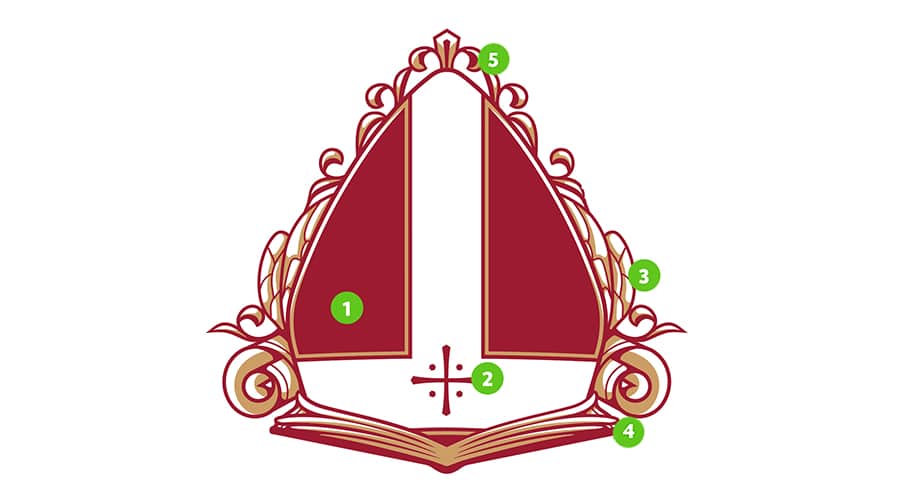
- Bishop’s Miter, in honor of St. Ambrose, the Bishop of Milan
- Central Cross – suggestive of the Jerusalem Cross and wounds of Christ
- Bee Wings – St. Ambrose was known as the “honey-tongued doctor”
- Book and Scroll – points to the classical methods of education at the Academy
- Fleur-de-lis – honoring the Trinity and purity of the Blessed Mother
We chose a font that was based on classic chiseled lettering and has been created with a geometric and humanistic nature.


