Website Design: Complete Guide to Creating Professional Websites in 2025
In today’s digital landscape, your website design can make or break your business success. Research indicates that users form a visual impression of a website extremely quickly. One study found that people can assess the visual appeal of a web page in just 50 milliseconds (Lindgaard et al., 2006, Behaviour & Information Technology).
Visual design plays a critical role in shaping these impressions. The Stanford Web Credibility Project reported that nearly half of users (46.1%) evaluated a website’s credibility based on its design look (layout, typography, and visual appeal) (Fogg et al., 2002, Stanford University). Whether you’re launching a new site or redesigning an existing one, understanding modern website design principles is crucial for creating an online presence that drives traffic, engages your target audience, and converts visitors into customers.
This comprehensive guide covers everything you need to know about website design in 2025, from planning and core principles to the latest tools and trends. You’ll learn how to create a professional website that not only looks stunning but also performs exceptionally across all devices and search engines.
What is Website Design and Why It Matters
Website design combines visual aesthetics, user experience, and functionality to create an effective online presence that serves both users and business goals. Modern website design goes far beyond just making sites look attractive. It encompasses responsive web design, search engine optimization, accessibility, and conversion optimization.
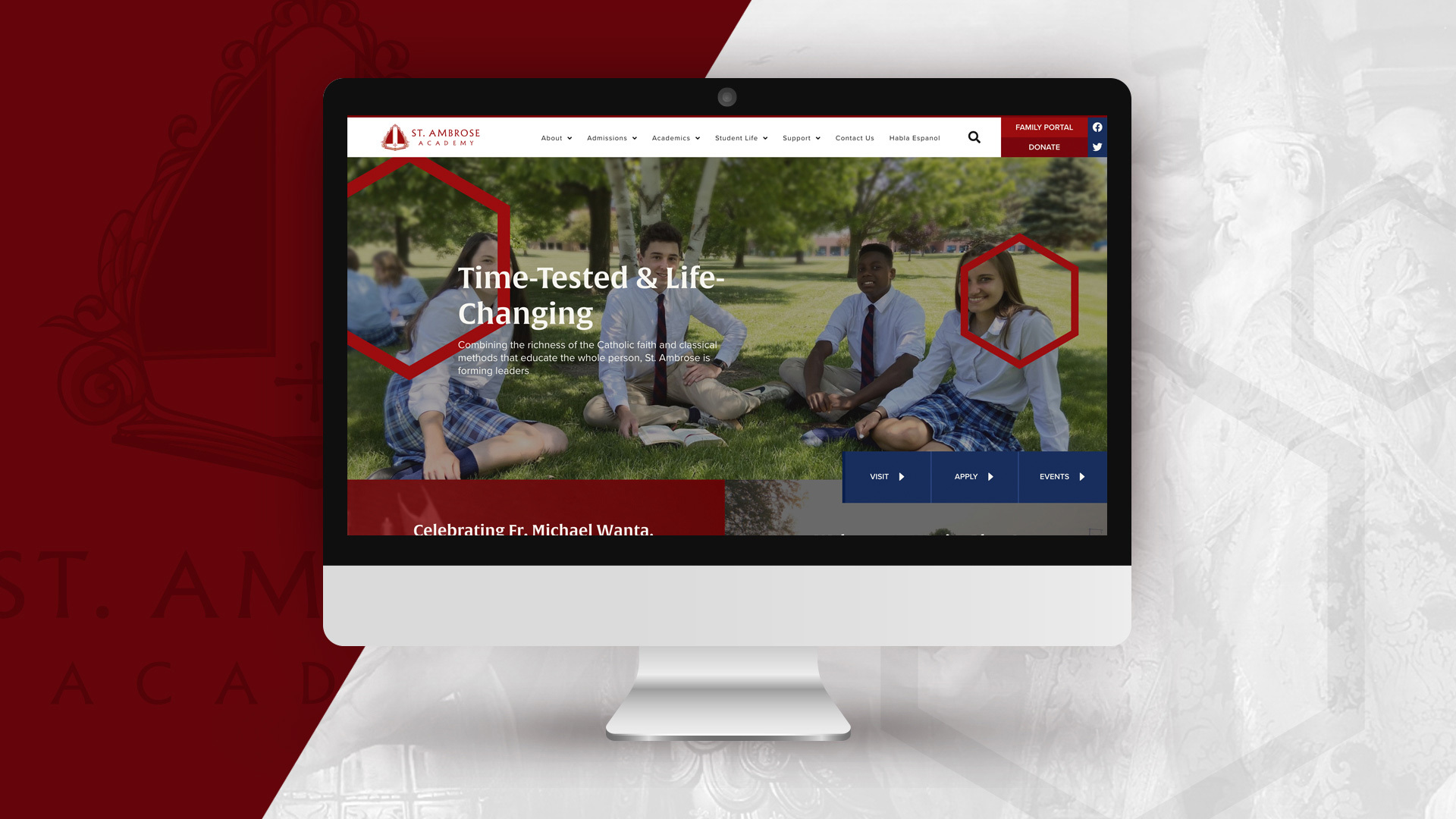
Check out our work with St. Ambrose including branding and website design!
Good website design increases user engagement and conversion rates. When visitors land on a well-designed website, they’re more likely to stay longer, explore multiple pages, and take desired actions like making purchases or filling out contact forms. Professional website design builds trust and credibility with potential customers from the very first impression.
Today’s website design must consider multiple factors:
- User Experience: How easily visitors can navigate and interact with your site
- Mobile Responsiveness: Ensuring your site works perfectly on all screen sizes
- Search Engine Optimization: Helping search engines understand and rank your content
- Loading Speed: Optimizing performance to keep visitors engaged
- Accessibility: Making your site usable for people with disabilities
- Conversion Optimization: Guiding visitors toward specific business goals
The cost of poor website design is significant. Research from mobile UX and web performance studies suggests that 53% of mobile users will abandon a site if it takes more than three seconds to load (as often cited in summaries of Google’s “The Need for Mobile Speed” report).
In addition, industry sources claim that 38% of people will stop engaging with a website if the content or layout is unattractive, a figure commonly associated with Adobe’s research on design impact.
Planning Your Website Design Strategy
Before diving into colors, fonts, or layouts, successful website design starts with thorough planning. This strategic foundation ensures your site effectively serves your target audience and achieves your business objectives.
Define Your Target Audience
Understanding your target audience demographics, needs, and browsing behaviors before designing is crucial for creating a site that resonates with visitors. Consider factors like age, location, income level, technical expertise, and the devices they typically use to browse the web.
Create detailed user personas that include:
- Demographics and psychographics
- Goals and pain points
- Preferred communication styles
- Technology comfort levels
- Online shopping behaviors
Set Clear Business Goals
Set clear business goals like lead generation, sales, or brand awareness to guide design decisions throughout the project. Your website should have a primary purpose, whether that’s selling products, capturing leads, providing information, or building community.
Common website goals include:
- E-commerce: Direct product sales and revenue generation
- Lead Generation: Collecting contact information for future marketing
- Brand Awareness: Establishing thought leadership and visibility
- Customer Support: Providing resources and self-service options
- Content Marketing: Sharing valuable information to attract organic traffic
Research Competition and Industry Standards
Research competitor websites to identify design trends and opportunities for differentiation. Analyze what works well in your industry while finding ways to stand out from the crowd.
Essential Design Research Steps
Conduct user interviews to understand visitor expectations and pain points when interacting with websites in your industry. This qualitative research provides insights that analytics alone cannot reveal.
Analyze competitor color schemes, typography, and layout patterns in your industry to understand established conventions while identifying opportunities for innovation. Study successful websites in similar business categories for inspiration, but avoid copying designs outright.
Document technical requirements like mobile responsiveness and loading speed goals early in the planning process. Set specific benchmarks such as achieving Google PageSpeed scores above 90 and ensuring 3-second load times on mobile devices.
Create a site map outlining all pages and their hierarchical relationships to establish clear navigation structure. Develop wireframes showing layout structure without colors or detailed content to focus on functionality and user flow.
Core Website Design Principles
Understanding fundamental design principles helps create websites that are both visually appealing and highly functional. These principles guide decision-making throughout the design process and ensure consistency across all web pages.
Visual Hierarchy and Layout Structure
Visual hierarchy guides users through content using size, color, and positioning to prioritize information effectively. The most important elements should be largest and most prominent, while supporting content uses smaller sizes and muted colors.
Effective visual hierarchy techniques include:
- Size: Larger elements naturally draw attention first
- Color: Bright or contrasting colors create focal points
- Position: Items in the upper left get noticed first in Western cultures
- Spacing: White space around elements increases their perceived importance
- Typography: Bold fonts and different font weights establish content relationships
Balance distributes visual weight evenly across pages using symmetrical or asymmetrical layouts. Symmetrical balance creates formal, stable feelings, while asymmetrical balance feels more dynamic and modern.
Consistency and Professional Appearance
Consistency in fonts, colors, and spacing creates professional appearance and improves usability by establishing predictable patterns for users. When design elements follow consistent rules, visitors can focus on content rather than learning new interface conventions on each page.
Key consistency areas include:
- Navigation: Menu structure and labeling should remain identical across pages
- Color Usage: Primary, secondary, and accent colors should serve consistent purposes
- Typography: Heading styles, body text, and link formatting should follow established patterns
- Button Design: Call-to-action buttons should use consistent styling and behavior
- Spacing: Margins, padding, and grid systems should follow standardized measurements
White Space and Content Balance
White space (negative space) improves readability and prevents overwhelming visitors with content. Adequate spacing between elements reduces cognitive load and helps users process information more effectively.
White space serves multiple purposes:
- Improved Readability: Text becomes easier to scan with proper line spacing
- Enhanced Focus: Important elements stand out when surrounded by space
- Professional Appearance: Generous spacing conveys quality and attention to detail
- Mobile Optimization: Touch targets need adequate space for easy interaction
Typography and Color Theory
Choose 2-3 complementary fonts maximum, one for headings and one for body text, to maintain readability while expressing personality. Web fonts should load quickly and display consistently across different browsers and devices.
Typography best practices include:
- Hierarchy: Use different font sizes and weights to establish content relationships
- Readability: Ensure sufficient contrast between text and background colors
- Loading Speed: Limit the number of font variants to improve site performance
- Mobile Optimization: Test font sizes across different screen sizes
Use color psychology strategically: blue builds trust and professionalism, green suggests growth and health, red creates urgency and excitement. Your color palette should align with your brand personality and industry expectations.
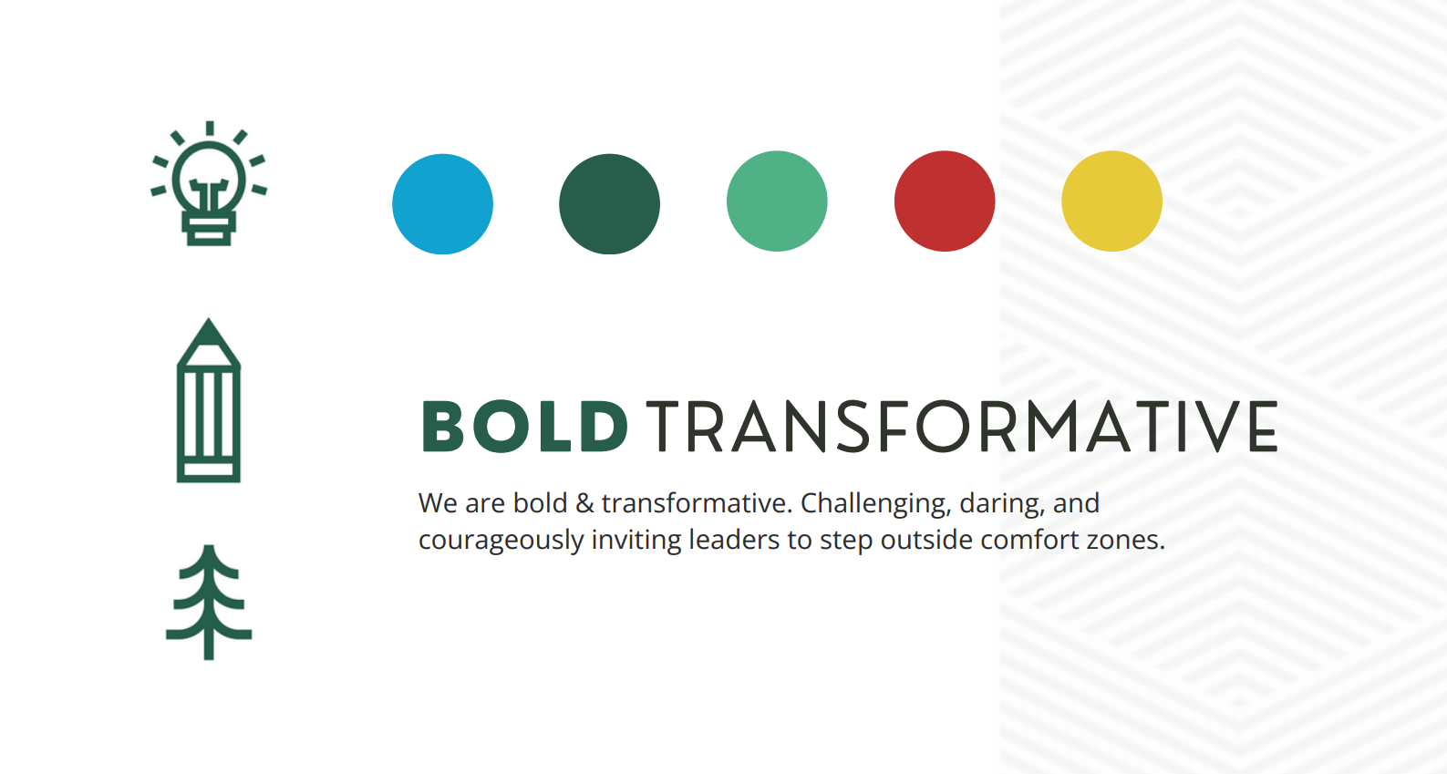
This concept, developed by Hannah as part of the initial mood board for the Business Camp branding project, establishes a foundation for the brand’s visual and verbal identity. It introduces a proposed color palette, sample brand voice expressions, and versatile iconography intended for use across marketing and communication assets.
Ensure sufficient color contrast (4.5:1 ratio minimum) for accessibility compliance, making your content readable for users with visual impairments. Limit your color palette to 3-5 colors to maintain cohesive brand identity while avoiding visual confusion.
Modern Website Design Tools and Platforms
The landscape of website design tools has evolved dramatically, offering solutions for every skill level and budget. Understanding the strengths and limitations of different platforms helps you choose the right approach for your specific needs.
Website Builders and No-Code Solutions
Drag-and-drop builders like Wix, Squarespace, and Webflow require no coding knowledge while producing professional results. These platforms provide pre-designed website templates that can be customized with your content, colors, and branding.
Free website builder options include:
- Wix: Offers extensive customization with ADI (Artificial Design Intelligence)
- WordPress.com: Free tier with WordPress branding and limited features
- Google Sites: Basic but reliable for simple business websites
- Weebly: User-friendly interface with built in seo tools
Most website builder platforms include:
- Responsive website templates for various industries
- Drag-and-drop editing interfaces
- Basic search engine optimization features
- E-commerce functionality for online stores
- Analytics and performance tracking tools
Content Management Systems
WordPress powers 43% of all websites and offers thousands of customizable themes for different industries and purposes. As an open-source platform, WordPress provides unlimited creative freedom while maintaining user friendly editing capabilities.
WordPress advantages include:
- Flexibility: Unlimited customization through themes and plugins
- SEO-Friendly: Built in seo features and optimization plugins available
- Community Support: Extensive documentation and developer resources
- Cost-Effective: Core platform is free, with costs only for hosting and premium themes
- Scalability: Grows with your business from simple blogs to complex e-commerce sites
Professional Design Tools
Design tools like Figma, Adobe XD, and Sketch create professional mockups and prototypes before development begins. These tools enable designers to experiment with layouts, test user interactions, and collaborate with clients and developers.
AI create tools are revolutionizing website design by generating complete websites from simple text descriptions in minutes. These AI-powered solutions analyze your business requirements and automatically create layouts, select colors, and suggest content structures.
Choosing the Right Design Platform
Website builders work best for small businesses needing quick, professional results without technical complexity. They’re ideal when you need to launch quickly and don’t require extensive customization.
Content management systems suit businesses requiring frequent content updates, multiple authors, or complex functionality. They offer more flexibility but require slightly more technical knowledge.
Custom development serves complex businesses with unique functionality requirements that can’t be met through templates or standard platforms. This approach provides unlimited possibilities but requires significant time and budget investment.
Consider these factors when choosing:
- Budget: Initial costs and ongoing maintenance expenses
- Timeline: How quickly you need to launch your new site
- Technical Skills: Your team’s comfort level with different platforms
- Scalability: Future growth plans and feature requirements
- Custom Domain: Ability to use your own domain name professionally
Mobile-First and Responsive Design
Mobile devices account for 58% of global website traffic as of 2025, making mobile optimization essential rather than optional. Google uses mobile-first indexing, ranking mobile versions of websites primarily in search results.
Responsive Design Implementation
Responsive web design automatically adapts layouts to different screen sizes and orientations without requiring separate mobile versions. This approach provides consistent user experiences across desktop computers, tablets, and smartphones.
Key responsive design elements include:
- Flexible Grid Systems: Layouts that scale proportionally across screen sizes
- Fluid Images: Photos and graphics that resize without losing quality
- Scalable Typography: Text that remains readable on small screens
- Touch-Friendly Navigation: Menus optimized for finger navigation
- Optimized Forms: Input fields sized appropriately for mobile devices
Touch-friendly buttons should be minimum 44px by 44px for easy mobile navigation, with adequate spacing between clickable elements to prevent accidental taps.
Mobile Performance Optimization
Optimize images and minimize code to achieve 3-second mobile loading times, as mobile users have less patience for slow-loading sites than desktop users. Mobile optimization techniques include:
- Image Compression: Using WebP format and appropriate file sizes
- Code Minification: Removing unnecessary characters from CSS and JavaScript
- Caching Implementation: Storing frequently accessed files locally
- Content Prioritization: Loading critical content first
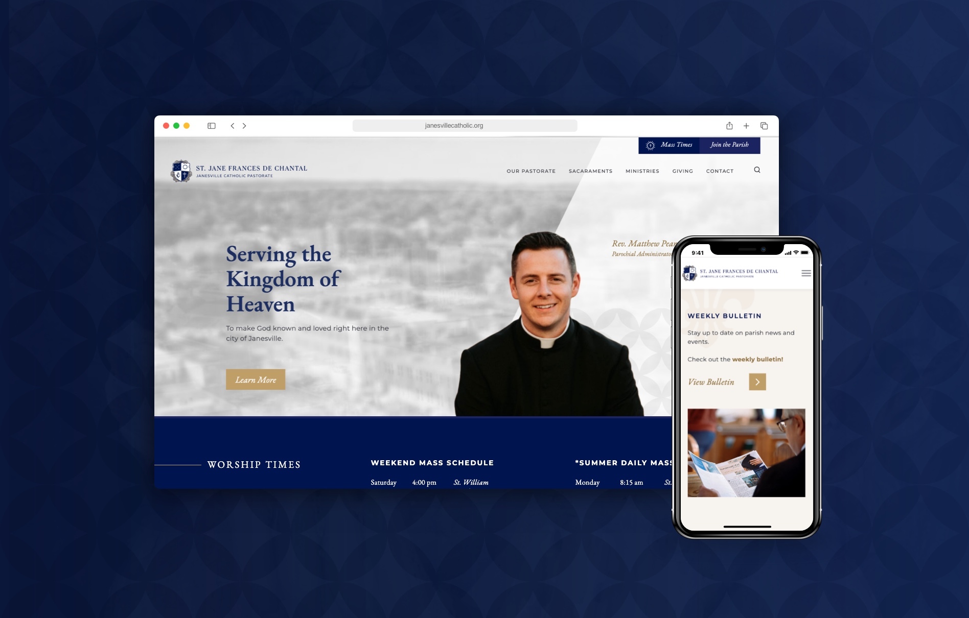
This example highlights the website we designed for the St. Jane Frances de Chantal Pastorate. Our approach prioritizes responsive design, ensuring an engaging and seamless user experience across all devices, with particular attention to mobile accessibility.
Mobile-first design prioritizes the mobile experience during initial planning, then scales up to desktop rather than scaling down from desktop designs. This approach ensures core functionality works perfectly on smaller screens.
User Experience (UX) Design Best Practices
Exceptional user experience design focuses on making websites intuitive, efficient, and enjoyable to use. UX design directly impacts how long visitors stay on your site and whether they complete desired actions.
Navigation and Site Structure
Navigation should be intuitive with clear menu labels and logical page organization that helps users find information quickly. Your site structure should reflect how users think about your business rather than internal organizational charts.
Effective navigation includes:
- Clear Menu Labels: Use terms your target audience understands
- Logical Hierarchy: Group related pages together
- Search Functionality: Include search for websites with more than 20 pages of content
- Breadcrumb Navigation: Help users understand their location within the site
- Consistent Placement: Keep navigation elements in expected locations
Call-to-Action Optimization
Design clear call-to-action buttons using contrasting colors and action-oriented text that tells users exactly what will happen when they click. Effective CTAs use strong verbs like “Get Started,” “Download Now,” or “Schedule Consultation.”
Place primary call-to-action buttons above the fold and repeat throughout pages where appropriate. Each page should have one primary CTA to avoid decision paralysis, with secondary actions available but less prominent.
Conversion Optimization Through Design
Use urgency and scarcity elements like limited-time offers to encourage action, but ensure these elements are genuine rather than manipulative. Display trust signals like security badges, certifications, and customer reviews prominently to build credibility.
Minimize form fields to reduce friction. Ask only for essential information initially. You can always collect additional details later in the customer relationship. Long forms significantly reduce conversion rates, especially on mobile devices.
Building Credibility and Trust
Add contact information and social proof like testimonials to build credibility with visitors who may be unfamiliar with your brand. Include:
- Professional Logo: Consistent branding across all pages
- Contact Information: Easy ways to reach your business
- Customer Testimonials: Real reviews and success stories
- Security Badges: SSL certificates and payment security indicators
- About Page: Information about your team and company history
Technical Website Design Considerations
Technical aspects of website design significantly impact user experience, search engine rankings, and long-term maintenance requirements. Getting these fundamentals right from the beginning prevents costly problems later.
Performance and Speed Optimization
Optimize high quality images using WebP format and compression to reduce loading times without sacrificing visual appeal. Large image files are often the biggest culprits in slow website performance.
Achieve Google PageSpeed scores above 90 for optimal user experience and SEO benefits. Performance optimization techniques include:
- Image Optimization: Compress images and use appropriate file formats
- Code Minification: Remove unnecessary spaces and comments from code
- Browser Caching: Store files locally to speed up repeat visits
- Content Delivery Networks: Serve files from geographically closer servers
- Database Optimization: Clean up unnecessary data and optimize queries
Enable browser caching to store frequently accessed files locally, reducing server requests on subsequent visits. Minimize HTTP requests by combining CSS and JavaScript files when possible.
Search Engine Optimization Integration
Implement SSL certificates for security and improved search engine rankings, as Google considers HTTPS a ranking factor. Use clean, SEO-friendly URLs with descriptive keywords instead of random characters or numbers.
Add schema markup to help search engines understand and display your content more effectively in search results. This structured data can improve visibility through rich snippets and featured results.
SEO-friendly design practices include:
- Semantic HTML: Use proper heading tags (H1, H2, H3) for content hierarchy
- Alt Text: Descriptive alternative text for all images
- Meta Descriptions: Compelling descriptions for each page
- Internal Linking: Strategic links between related pages
- XML Sitemaps: Help search engines discover all your pages
Accessibility and Compliance
Ensure accessibility compliance with WCAG 2.1 guidelines for disabled users, making your website usable by people with visual, auditory, motor, or cognitive impairments. Accessibility features include:
- Color Contrast: Sufficient contrast ratios for text readability
- Keyboard Navigation: Full functionality without requiring a mouse
- Screen Reader Support: Proper markup for assistive technologies
- Alternative Text: Descriptions for images and media content
- Focus Indicators: Clear visual indicators for keyboard navigation
Accessibility compliance not only serves users with disabilities but often improves the overall user experience for everyone while reducing legal risks.
Website Design Trends for 2025
Staying current with design trends helps ensure your website feels modern and relevant while avoiding outdated aesthetics that might undermine credibility.
Visual and Interactive Trends
Dark mode options provide eye strain relief and modern aesthetic appeal, especially popular among tech-savvy users and for websites viewed in low-light conditions. Implement dark mode as an optional toggle rather than the default to accommodate all user preferences.
Micro-interactions like hover effects and loading animations enhance user engagement by providing immediate feedback for user actions. These subtle animations make interfaces feel more responsive and polished without impacting performance.
Minimalist design with bold typography creates clean, professional appearances that load quickly and work well across all screen sizes. This approach emphasizes content over decoration while maintaining visual interest through strategic use of white space and typography.
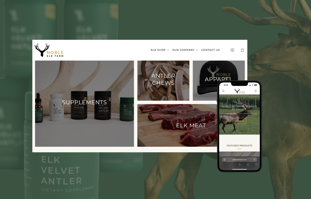
We designed Noble Elk Farm’s website with a focus on minimalist aesthetics and bold typography, creating a clean, modern digital presence that reflects the brand’s identity while enhancing readability and user engagement.
Video backgrounds and interactive elements increase time spent on pages by creating immersive experiences. However, ensure video content doesn’t slow loading times or distract from important information.
Technology Integration Trends
AI chatbots integrated into design provide instant customer support capabilities while collecting valuable data about visitor questions and needs. Modern chatbots can handle routine inquiries and escalate complex issues to human representatives.
Voice search optimization becomes increasingly important as more users interact with websites through voice assistants and smart speakers. Design content and navigation with natural language queries in mind.
Headless CMS architectures separate content management from front-end presentation, enabling faster, more flexible website experiences. This approach allows developers to use modern frameworks while maintaining user friendly content editing capabilities.
Testing and Launching Your Website Design
Thorough testing before launch prevents embarrassing mistakes and ensures your website functions correctly across all devices and browsers. A systematic testing approach identifies issues before real visitors encounter them.
Pre-Launch Testing Procedures
Conduct usability testing with real users to identify navigation and functionality issues that might not be obvious to designers and developers. Watch how actual users interact with your site to discover pain points and areas for improvement.
Test website performance across different browsers including Chrome, Safari, Firefox, and Edge to ensure consistent experiences. Browser compatibility issues can create frustrating experiences for visitors using different technologies.
Verify mobile responsiveness on various devices and screen sizes before launch, testing both portrait and orientation modes. Use browser developer tools and physical devices to identify layout problems.
Check all forms, links, and interactive elements function correctly across different scenarios. Test error handling, submission processes, and confirmation messages to ensure smooth user experiences.
Analytics and Monitoring Setup
Set up Google Analytics and Google Search Console to track performance after launch, establishing baseline metrics for future optimization efforts. Configure goal tracking for important business actions like form submissions, purchases, or newsletter signups.
Monitor key performance indicators including:
- Page Load Speed: Average loading times across different pages
- Bounce Rate: Percentage of visitors who leave after viewing one page
- Conversion Rate: Percentage of visitors who complete desired actions
- Mobile Traffic: Proportion of visitors using mobile devices
- Organic Traffic: Visitors from search engines
Post-Launch Optimization
Monitor user behavior through heatmaps to identify areas for design improvement and understand how visitors actually interact with your pages. Tools like Hotjar or Crazy Egg provide visual data about click patterns and scroll behavior.
Conduct A/B tests on different design elements to optimize conversion rates systematically. Test one element at a time, such as button colors, headline text, or form layouts, to isolate what improvements actually work.
Regularly update content and refresh design elements to maintain user interest and search engine relevance. Fresh content signals to search engines that your site remains active and valuable.
Analyze website analytics monthly to guide future design decisions and updates. Look for patterns in user behavior, identify pages with high exit rates, and discover opportunities for improvement.
Ongoing Maintenance and Updates
Website design requires ongoing attention to maintain security, performance, and relevance. Regular maintenance prevents problems and ensures your site continues serving business goals effectively.
Create a maintenance schedule that includes:
- Security Updates: Keep CMS, plugins, and themes current
- Content Reviews: Ensure information remains accurate and current
- Performance Monitoring: Track loading speeds and fix issues promptly
- Backup Procedures: Regular backups to prevent data loss
- User Feedback: Collect and respond to visitor suggestions
Professional website design is an ongoing process rather than a one-time project. The most successful websites evolve continuously based on user feedback, analytics data, and changing business needs.
By following these comprehensive guidelines, you’ll create a website that not only looks professional but also drives traffic, engages visitors, and supports your business objectives effectively. Remember that great website design combines aesthetic appeal with functional excellence, creating experiences that users love and search engines reward.
The investment in quality website design pays dividends through improved user engagement, higher search rankings, and increased conversions. Whether you choose a free website builder or custom development, focus on creating value for your target audience while supporting your business goals.
Start planning your website design today by defining your objectives, researching your audience, and selecting the right tools for your needs. With careful planning and attention to these principles, you’ll create a website that serves your business well for years to come.
Need a creative team to get you off and running? Check out our website design services and contact us today for a free marketing consultation.


