
We had the pleasure of working with one of the finest Catholic school's in the Madison area in a rebrand from logo to website. Check out the full description of the inspiration and concept below. This hard work was recognized with a Gold Award from the American Advertising Federation in Madison.
Prior to the rebrand, in 2020, their 14th Annual Benefit Dinner was held virtually due to the ongoing pandemic. Despite the change in format, the event was a great success with a collection of branded elements we created around the theme "See the Joy". We created a bright, wintery brand identity for the benefit that embodied both joy and humor and chose fonts and graphics that gave a nod to the artisan treats that guests would receive in their Party Boxes.
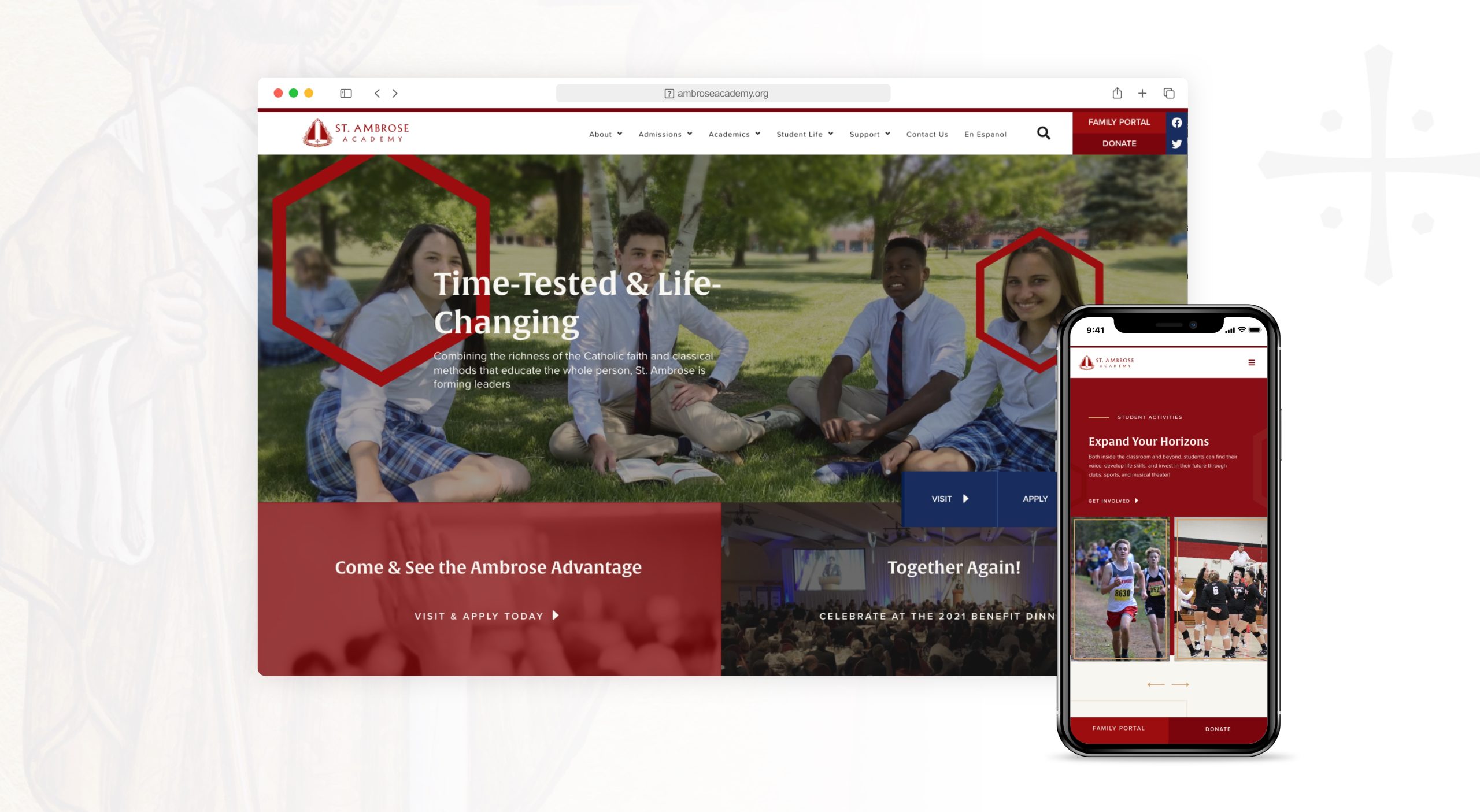
St. Ambrose Academy underwent a rebranding process to create a modern, yet timeless image for the school. The new branding incorporates nods to classical church history and the school’s namesake, Saint Ambrose. By striking a balance between tradition and innovation, the school hopes to better represent its commitment to academic excellence and Catholic values while also reaching new generations of students and families.
Inspiration & Meaning
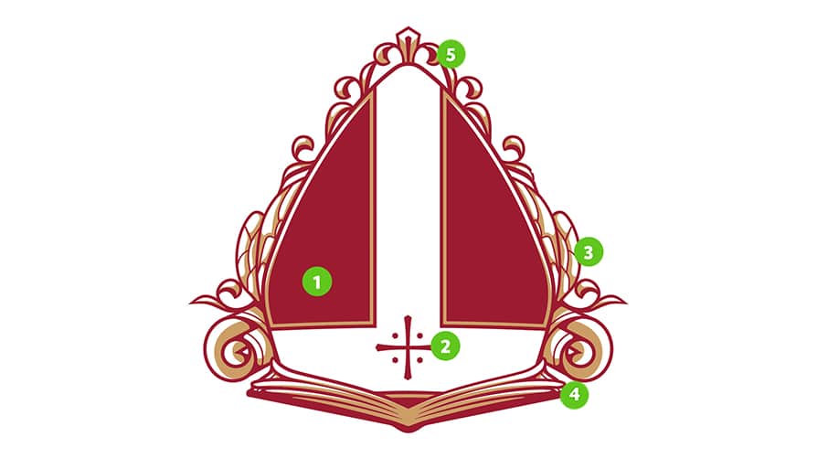
The St. Ambrose Academy logo is a nod to the past and embodies the heart of their identity as a school community united by time-tested methods of classical education and their Catholic Faith.
-
- Bishop’s Miter, in honor of St. Ambrose, the Bishop of Milan
- Central Cross – suggestive of the Jerusalem Cross and wounds of Christ
- Bee Wings – St. Ambrose was known as the “honey-tongued doctor”
- Book and Scroll – points to the classical methods of education at the Academy
- Fleur-de-lis – honoring the Trinity and purity of the Blessed Mother
We chose a font that was based on classic chiseled lettering and has been created with a geometric and humanistic nature.

![]()
Custom Icons
![]()

St. Ambrose Academy’s 14th Annual Benefit Dinner was held virtually in 2020 due to the ongoing pandemic. Despite the change in format, the event was a great success with a collection of branded elements we created around the theme “See the Joy”.
We created a bright, wintery brand identity for the benefit that embodied both joy and humor, as well as chose fonts and graphics that gave a nod to the artisan treats that guests would receive in their Party Boxes. Branding was tied together across all the collateral, from the invitation suites to the “Party Boxes,” as well as social media graphics.

Groups were encouraged to host their own “watch party” and this format allowed attendees to enjoy the evening from the comfort of their own homes, whether it was with just their significant other or if they felt comfortable enough to have a small gathering of close friends.


Each group of guests received a Party Box filled with branded items such as wine glasses, honey from the Sisters of Mary Morning Star, custom coasters, and treats!


The evening was a testament to the resilience and adaptability of the St. Ambrose Academy community, and a reminder of the school’s commitment to providing an exceptional education to its students.