St. Cecilia Catholic Church is located in the heart of Wisconsin Dells and has stood as an icon for generations. In 2015 the existing building was taken down. In its place a new one has risen and, with it, a new brand, web, print and video presence as well.
The Problems and the Solutions
St. Cecilia’s has a unique situation. Located in one of the top tourist destinations in the country, a very large portion of their target audience is made up of visitors to the parish who are staying in the area for the weekend. Unsurprisingly, St. Cecilia’s website gets thousands of hits during those summer weekends, so it is essential that it meets the needs of those visitors as well as the more traditional needs of a parish. This was the impetus for their decision to reach out to us.
During an initial meeting, it also became clear that St. Cecilia’s brand identity was, as is often the case with parishes, haphazard and more accidental than anything else. Developing a logo and consistent brand would help the parish greatly.
We also discussed the considerable benefit of using video, particularly to effectively convey to thousands of people the value of reaching the target in a $12 million building campaign.
Getting Things Started
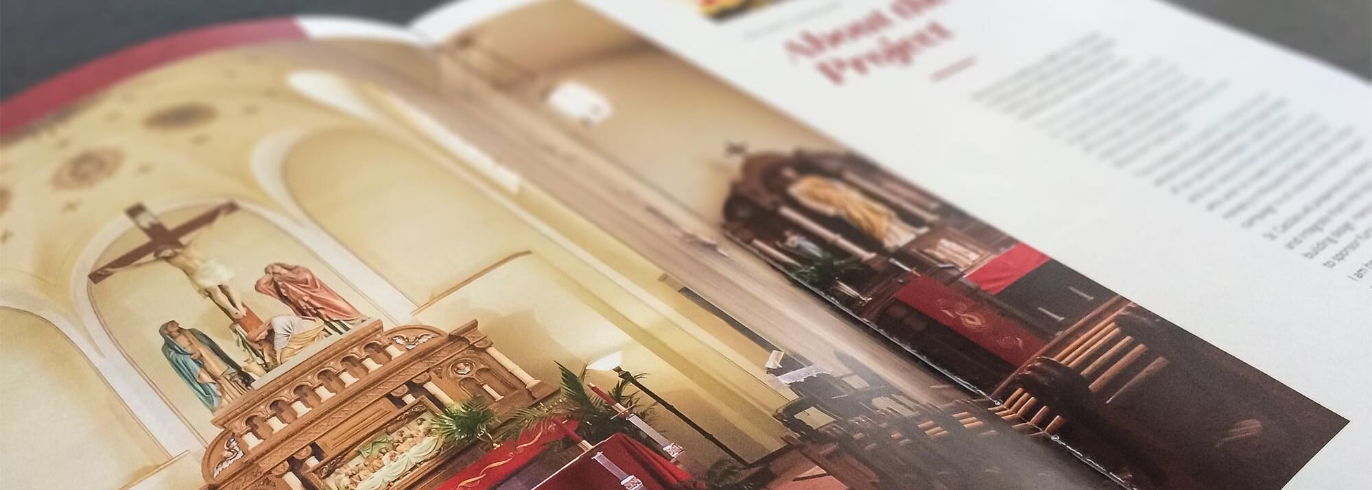
When the project began, St. Cecilia’s had some significant upcoming events for which various printed materials were needed. In order to ensure that those materials would not become obsolete as we moved forward, it was imperative that we complete some initial branding work. Typography and color became the top priority.
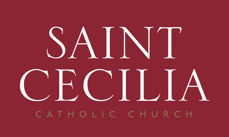
We presented several options, but settled quickly on a wordmark set in Serlio, a typeface based on the letterforms found on the architecture in Rome. Cecilia is a Roman saint, and bringing more aspects of her life and martyrdom into the identity of the parish was quickly identified as a desirable path to take.
Taking it Public
As soon as we had a good grasp on where the branding would eventually be, we could begin work on two crucially important events for the capital campaign.
The first event, “The Church is Alive,” would be the first opportunity to display the updated look and generate excitement for the future, as well as give concrete opportunities for prospective donors to sponsor various aspects of the reconstruction.
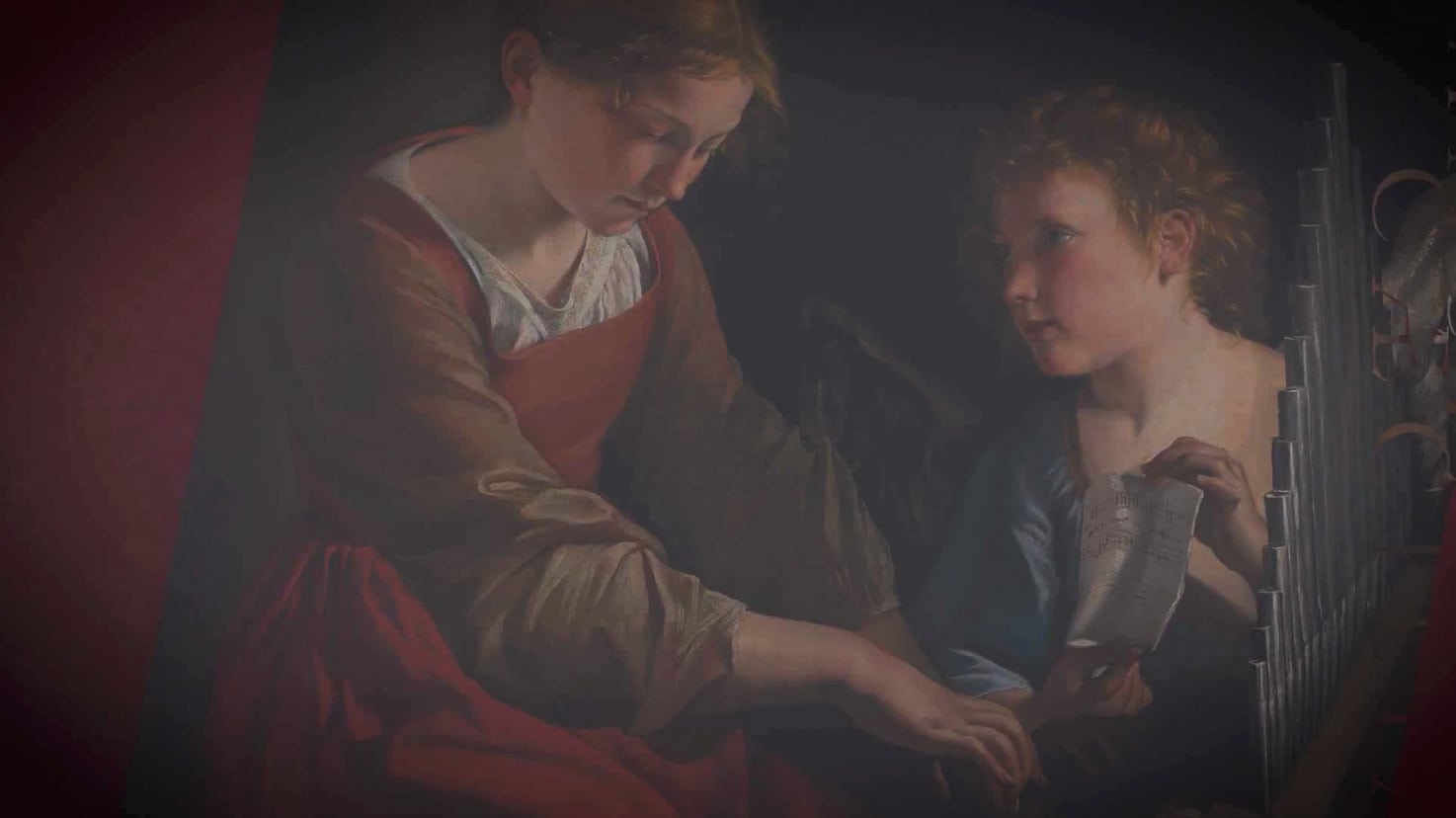
The event took place during Easter, which, along with its title, made a focus on the Resurrection an easy choice. We found a beautiful piece of artwork that was available in the public domain and large enough for display at banner sizes to be the centerpiece of the materials.
The Development of an Icon
We set out to develop an icon that would capture the essence of Saint Cecilia and bring her story to the forefront. However, it was equally if not more important to ensure that the icon be, just as the Church it represents is, unequivocally Christocentric.
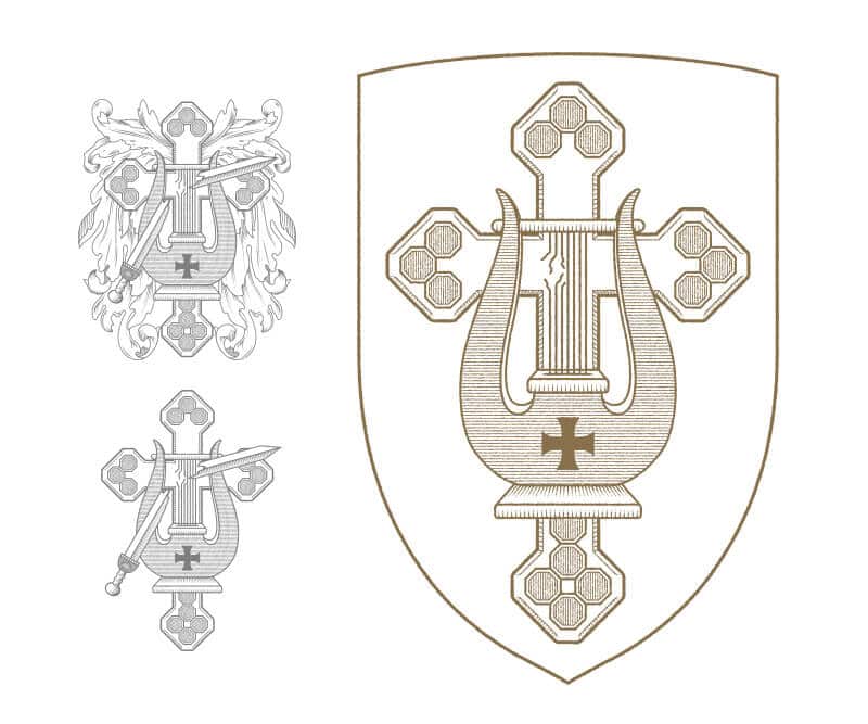
Her roman heritage, the nature of her martyrdom, her place as patron saint of musicians, her heroic courage in carrying her cross and her undying love for Jesus Christ were all necessary elements of the icon.
A Complete Identity
We iterated over several versions of the icon, including images of a broken executioner’s sword and a nod to the ornamentation typical of European heraldry. However, we discovered that Ecclesial heraldry did not allow for this sort of decoration, and it was decided that the sword was unnecessary.
Ultimately we ended with an icon that includes a harp (as Saint Cecilia is often pictured holding) with three broken strings, representing the three times she was struck in an unsuccessful attempt at her execution. This is laid over a cross whose shape and ornamentation are inspired by a treasure found by the parish’s current pastor: a relic, a small piece of the true cross of Christ Himself. This relic will be given a special place of honor and visibility in the new chapel, the result of a successful capital campaign.
Going Online
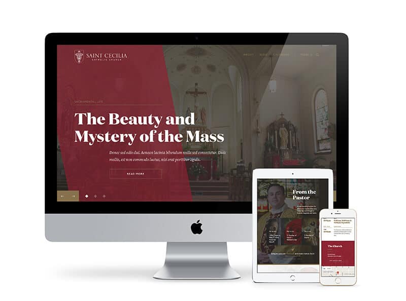
The website had to be both functional and express appropriately the beauty and sense of the sacred present in the Catholic Church. First and foremost, Mass times and directions had to be front and center. We developed a custom Mass times manager that displayed both the next available Mass and the Mass times for the weekend as well as a link to the full Mass schedule. We also integrated Google Maps, giving visitors one-click directions that automatically open in the Google Maps app on their phone.
Furthermore, it was important to bring some order and management ability to their events, so we customized a calendar to fit their needs and their brand. We also called attention to the capital campaign video, integrated Twitter and Instagram, and we developed a section specific to the idea that the Church is not just the local parish, but a universal body.
All in all, the ability for St. Cecilia’s to meet the needs of her parishioners and visitors was totally transformed. Combined with the beautiful new brand and beautiful new chapel, St. Cecilia’s is ushering in a new era for Catholics and the Catholic Church in Wisconsin Dells.
