Typography is important. The most straightforward illustration of that fact is typography done poorly. At best, haphazard or lazy typography is distracting; at worst, it causes confusion and renders the content unreadable. We've likely all clicked on a link to a website or blog post that we're interested in, only to be greeted by a swirling mess of colors and fonts. In that moment, we immediately lose confidence in the integrity of that content. We trust that website or article less because it looks like they either don't know better or don't care.
Typography drastically affects our perception of a given piece of content. I want to focus on its role in three particular areas: readability, content hierarchy, and visual interest.
Read 'Em and Weep
Good typography disappears, at least as it pertains to body content and long-form writing. It looks how it should look, removing any and all obstacles between the reader and the content he or she is after. Language is the primary means we have of communication and, other than speech, the written word is the only tool in our toolbox. How it's written, i.e. the typography, is, therefore, a fundamentally important component of our communication as a society. It has to be right, and when it's right, it's invisible.
In that moment, we immediately lose confidence in the integrity of that content. We trust that website or article less because it looks like they either don't know better or don't care.
As a designer, it's crucially important to understand the purpose of the typefaces you're considering. Certain typefaces should never be used to set body copy—and the designer of the face never intended it to be used in that way. For example, setting body copy in a high-contrast modern like Didot is not a good idea. The dramatic difference between the thick and thin strokes of the letterforms (the contrast) is difficult for the eye to navigate, making for a tiring experience.
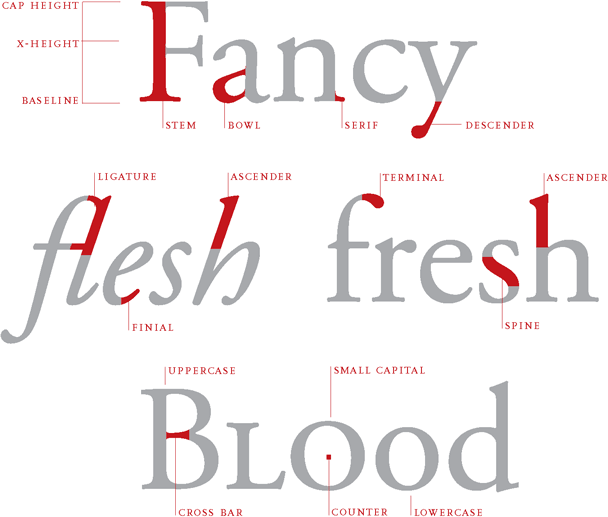 From Ellen Lupton's
Thinking with Type, a book every designer should read. Twice.
From Ellen Lupton's
Thinking with Type, a book every designer should read. Twice.
Major Import
Typography is also used to organize content and help the reader to visually understand the hierarchy of information that is being communicated to them. Size, color, weight...these are the tools we have to structure content and give the reader a visual map of what they're reading.
Typography's capacity for dictating a hierarchy can also be dangerous. I've definitely fallen victim to laying out my type in a way that eschewed hierarchy and focused almost exclusively on visual interest—resulting in emphases that are incorrect and misleading. If this happens, I have no choice but to go back and fix it. As a designer, it's my job to prevent this from happening and give proper weight to all of the ways that the type will affect a reader.
Accruing Interest
Type should be invisible in the middle of a paragraph, and it is fundamental in building a content's structure. Overall, though, to ignore typography's capacity to drastically affect design would be disingenuous. Headlines, titles, pull quotes—these can and should be more than purely informational. Typefaces are designed to elicit different mental images, associations, and emotions. A designer has to be in tune with those motivations and use them to enhance and augment the experience of the content.
As a designer, it’s my job to … give proper weight to all of the ways that the type will affect a reader.
What style of typeface is this? How has it been used in the past? With what will people associate this particular font? If you set something in Futura Condensed Extra Bold, you can bet that people will associate it with something "athletic." Why? Probably because of this. If you set your headlines in Bodoni, your piece might come across as chic, elegant, maybe even a little stuffy or self-important. You can blame that on this.
Typography matters. Investing time and effort into making sure that it is successful is an essential part of the design process. It can be tempting to assume that "picking fonts" is an arbitrary, 5-minute task, but that would be a miscalculation. Failure or success in this area can make all the difference.